
Are you tired of pinching and zooming on your phone just to read a website that wasn’t designed for mobile devices? Us too! That’s why we’re here to talk about the benefits of responsive web design and why mobile optimization matters.
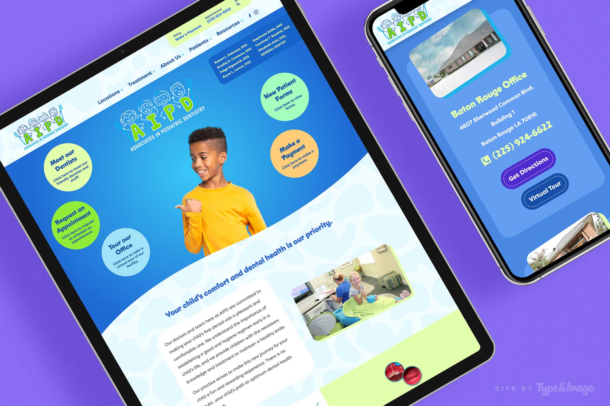
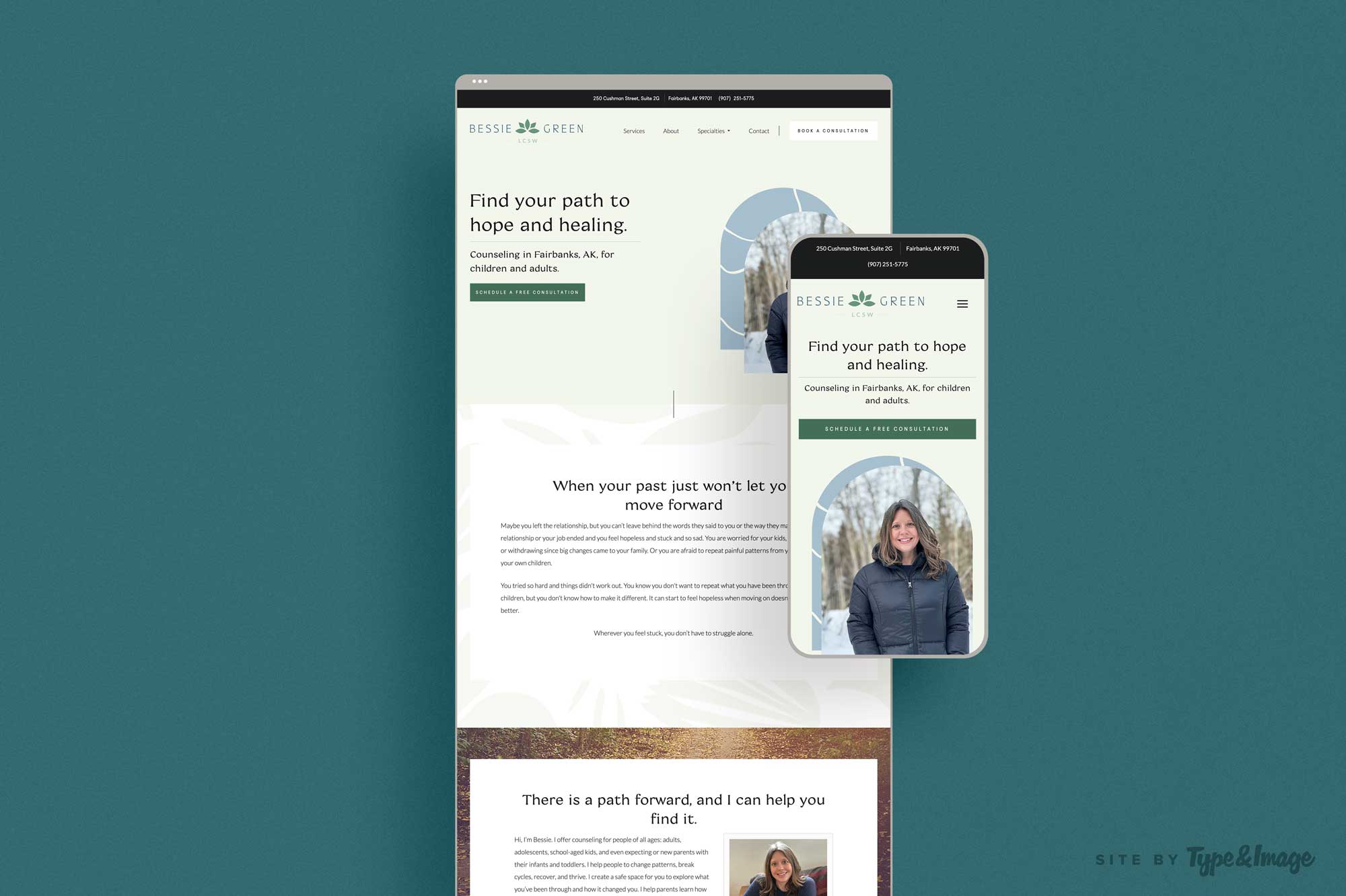
First of all, what is responsive web design? Simply put, it’s a design approach that ensures your website looks great and works well on any device, from desktop computers to smartphones and tablets. Responsive design means your website will automatically adjust its layout and content to fit the screen size of the device it’s being viewed on.
So why is mobile optimization so important? Let’s start with the fact that more people are browsing the internet on their phones than ever before. In fact, mobile devices account for over half of all internet traffic! If your website isn’t mobile-friendly, you’re missing out on a huge potential audience.
But it’s not just about reaching more people. Responsive web design also has a number of benefits for your business:
- Improved User Experience: Have you ever tried to navigate a non-mobile optimized website on your phone? It’s a nightmare! Responsive design ensures your website is easy to navigate and use on any device, which leads to a better user experience and happier visitors.
- Better SEO: Google has stated that mobile-friendliness is a ranking factor in search results. This means that if your website isn’t mobile-friendly, you may be missing out on valuable traffic from people searching for businesses like yours on their phones.
- Lower Bounce Rates: If your website isn’t mobile-friendly, visitors are more likely to leave your site and never come back. By optimizing your site for mobile devices, you can reduce bounce rates and increase the likelihood of visitors engaging with your business.
- Improved Brand Perception: A mobile-friendly website shows that your business is modern, up-to-date, and cares about its customers. By providing a seamless mobile experience, you can create a positive brand perception and build trust with potential customers.
So there you have it, folks! Responsive web design isn’t just about making your website look good on a phone—it’s about improving the user experience, boosting your SEO, and building a positive brand perception. If you haven’t already, it’s time to make the switch to a mobile-friendly website. Type&Image designs and builds all of our client websites with responsiveness as a top priority, so get in touch today if you’d like to consult with us on getting your website updated!